Fostering a Creative Culture
Since the birth of CPF in 1996, we emphasized on empowering and encourage people to maximize their effectiveness. We find ways to discover their organic strength and continue to cultivate their potentials by providing a microenvironment for them to grow. Although not everyone can withstand the rigorous tests of such challenging conditions, for those that thrive will find themselves a journey full of joy and excitement where they could establish success.
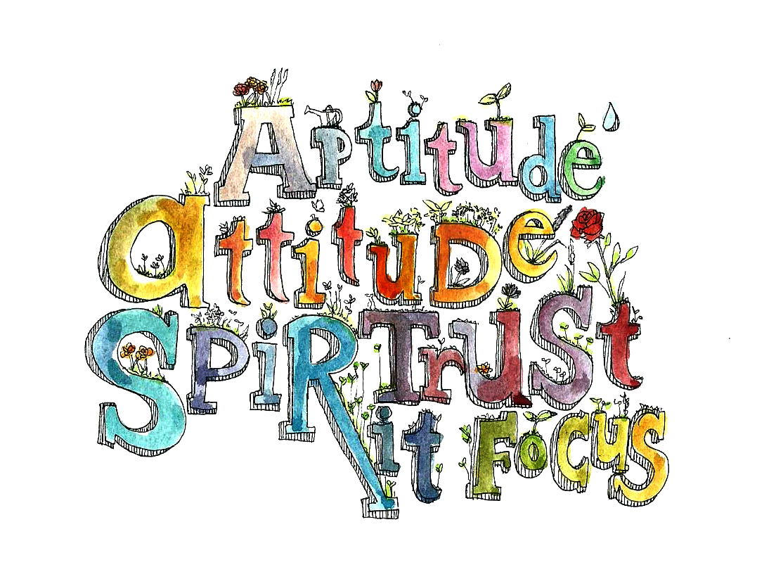
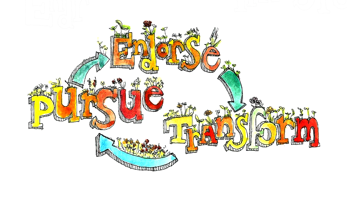
Fostering a creative culture is not a trivial task nor could be created by coincidence. People’s mentality has to be transformed and whatever is behind has to be practiced. From where we were as Calgary Programming Factory Inc. for the past 20 years, we have formed our core values and philosophies as a foundation for this transformation where our core values could be described in 5 simple words: Aptitude, Attitude, Spirit, Trust, and Focus and 1 iterative process: Endorse, Transform, and Pursue. These ingredients serve as the prerequisites for any individuals within the team to thrive and for the company as a whole to establish a positive culture.
From Calgary Programming Factory Inc. in which we referred to as “CPF 1.0”, we have formed an open and positive culture based on our core values and philosophies. That became our foundation and we transformed that into “CPF 2.0” where the “CPF” originally stands for “Calgary Programming Factory” now becomes “Creative, Professional, and Fun” which represents the culture that we embrace. We undertake challenges every day and we are transforming from individuals, the team, the culture, and to the company as a whole. Where once was a primitive I.T. consultant company now a sophisticated Creative Solution Provider. Where once called Calgary Programming Factory Inc. now became CPF Solutions Inc.
As we progress, we realize this open positive culture is the beginning of something bigger that we had anticipated and it’s the beginning of a sustainable creative culture that we want to form. Although this is just the beginning and this sustainable process still needs to be carved out. What we do know is that we can’t simply stop here and we have to keep moving. As Samuel Lee, aka the General, our Creative Development Manager, once presented the iterative process for CPF 2.0 is “Cherish. Perform. Flourish” which is also another abbreviation for CPF! So as a company, we always provide our best. We don’t just focus on revenues and profits. We don’t focus on the business plan and procedures before embarking on new ideas and projects. Every members of our team contributes. We define who we are and we are the ones who build our own future. We even define our own job titles based on our projections of our roles within the company and our organic strength. We set no boundaries between each other so that everyone could grow at their own will. We emphasize to establish trusted partnerships and provide the best service and complete solutions. As Ed Catmull, the president of Pixar Animation Studios and Walt Disney Animation Studios, said in his book titled “Creativity, Inc.: Overcoming the Unseen Forces That Stand in the Way of True Inspiration”, “if you give a good idea to a mediocre team, they will screw it up. If you give a mediocre idea to a brilliant team, they will either fix it or throw it away and come up with something better.” I believe CPF has to be that brilliant team and this is what makes CPF who we are.
Creativity & Innovation
As many organizations have already known, in today’s challenging and competitive world, innovation is often needed to drive any companies forward. Innovation is what drives companies ahead and allows one to anticipate market changes and even to define new markets. But what exactly is innovation? Most corporate marketers assume that innovation comes from the linear process of defining the market, researching customer needs, and then creating products or services to fulfill those needs. Innovation requires more than that. Innovation actually requires creativity and both go hand-in-hand. Creativity is the ability of creating new ideas and innovative thoughts while innovation is application of new ideas from cited creativity and innovation can be a new product, new service, or new way of doing something. In other words, creativity is about formulating new ideas while innovation is about executing the idea and translating that idea into a successful business.
Many companies are better at generating ideas than they are at commercializing or executing them. How many times one hears yet another company’s 5-year plan or roadmap and how many actually succeed in executing the plan? Thomas Edison, the greatest innovator of all time, stated that “innovation (genius) is 1% inspiration and 99% perspiration.” This reflects that innovation is by no means an accident and it requires the amount of time and effort one has to spend on perspiration versus inspiration. So how can any organizations who try to innovate overcome the barriers provided the limited amount of time, effort, resources, in addition to other constraints? Perhaps a shift in mentality or a shift in priorities? Perhaps an innovation strategy needs to be in place as a commitment to support the business strategy? Or a focus on scalable opportunities on top of its business model? Innovation by itself is extremely difficult to achieve. Whether you are an entrepreneur or corporate executive, “giving ideas life” is much like giving birth to a child. As such, a process is necessary to encourage creativity and innovation so that we could bring ideas to life from conception to creation. Before anything else, we also have to learn how to dream and imagine and stretch ourselves through new experiences so that we know how to be inspired.
In Search for the Creativity Process
We know that behind CPF, there’s creativity. How would one validate this creativity is true creativity or mine is and yours isn’t? The Componential Theory of Creativity is the answer as this theory is recognized as one of the major theories of creativity in individuals and organizations. It was first articulated by Teresa M. Amabile in 1983 and she has continued to evolve and refine this theory since then. Teresa Amabile is a Baker Foundation Professor, Edsel Bryant Ford Professor of Business Administration, and Director of Research at Harvard Business School. The Componential Theory of Creativity is a comprehensive model of the social and psychological components necessary for an individual to produce creative work and it specifies that creativity requires the following four components: 1) domain-relevant skills, 2) creativity-relevant processes, 3) intrinsic task motivation, and 4) social environment.
Three of the components (domain-relevant skills, creativity-relevant processes, and intrinsic task motivation) are within the individual while the remaining one (social environment) is outside the individual. In essence, this theory states that in order to produce creative work, the person must be an intrinsically motivated person with the domain-relevant expertise, the ability to establish creative thinking, and works in an environment which supports and encourage creativity.
Based on this theory, we could start to see that CPF has fostered and promoted such an environment for its team members to grow and provides opportunities for them to unleash their potentials in search for creativity. It’s really up to the individual to see how far he/she wants to go. Often, the only limiting factors are their own capacity and their capability. Their role in the team is not limited by their job title or job descriptions; rather it’s what they are able to contribute to the overall ecosystem within CPF and the team.
Domain-Relevant Skills
This component is within the individual and according to the theory, domain-relevant skills include knowledge, expertise, technical skills, intelligence, and talent in the particular domain where the problem-solver is working. This component encompasses a very wide spectrum in terms of knowledge since there are no boundaries to what you want to learn. In CPF, we emphasize on the discovery and cultivation of the individuals’ organic strengths to establish their own foundation and roots and to start to build up confidence. With that said, even though an individual has discovered and utilized their organic strengths in their work, it is not the end. It is important to continue and expand on their skills within their domain or CPF even encourages individuals to expand outside of their domain if it benefits to themselves and/or the team.
As an example, a software developer whose task is to make a change to a system without looking at the overall picture would not be able to justify if that particular change represents the best solution for the immediate problem. If that same developer expands their domain and look at the problem through the lens of a business analyst (BA), he/she would have a better understanding and would be able to provide a better solution. Conversely, a BA that has some technical background about the systems would deliver better results on the business requirements as he/she would digest what the users ask for. Rather just documenting strictly on the requirements as a BA, expanding his/her domain would allow the BA to become a BSA (business system analyst) where the expanded context of knowledge would contribute positively to his/her work.
Companies with standard organizational structure don’t usually promote this mindset and employees’ roles are largely defined by their job titles and job descriptions. As such, imaginary barriers will emerge between different roles and parties as the roles are isolated into their own domains and dependencies will be introduced as individuals will rely on other people to complete tasks that are not part of their own domain. There’s certainly nothing wrong with this under a standard organizational structure and it is an absolutely politically-correct course of action and mindset. However, this segregation of work sets restrictions on creativity and problem solving and the overall effectiveness is reduced.
CPF encourages individuals to wear different hats or to draw skills from other domains if that helps to improve the overall effectiveness and benefits the delivery of the results. Ultimately, the knowledge that you harvest from various domains and the necessary skills that you acquire in the target domain become your natural resources to synthesize a solution. This process allows you to expand the problem-solution space and as Herbert A. Simon, a Nobel Prize laureate, economist, and psychologist, termed this as the “network of possible wanderings” which is the rational space where he was able to become relational. Therefore, the larger the space results in the broader of solution possibilities.
Creativity-Relevant Processes
This component is also within the individual and the theory states that the associated creativity-relevant processes or creative thinking skills “include a cognitive style and personality characteristics that are conducive to independence, risk-taking, and taking new perspectives on problems, as well as a disciplined work style and skills in generating ideas.” Provided that an individual has the motivation and purpose to produce creative work and that he/she has an adequate or high level of domain-relevant skills or area of expertise to complete the work, the individual will not produce creative work if creative thinking skills are missing.
Creative thinking starts when you take on different approaches in finding a solution for the problem. A given problem often has many solutions and people without creative thinking skills could only see one way of solving the problem. Being abstract and having a tolerance for ambiguity also attributes to creative thinking. Being artistic also helps as Albert Einstein have stated that “the greatest scientists are artists as well.” This is a way to allow us to expand the context of our minds. In addition, a creative individual’s personality will allow him/her to feel comfortable disagreeing with others and tries out solutions that depart from or challenge the status quo. That individual’s creativity will be enhanced further if he/she habitually turns problems upside down and integrate knowledge from seemingly disparate fields and domains to form new solutions.
Your personality and characteristics have a large impact on the level to which you could attain and practice creative thinking. The psychometric profile tool called Lumina Spark from Lumina Learning illustrated a sound set of attributes or traits that one could have. Lumina embraces paradox where they believe that any individual could inherit opposing, competing, and contradictory aspects of their personality and I believe this is true.
Looking at the Lumina Spark portrait we could identify that creative individuals will most likely inherit qualities from the “Inspiration Driven” and “Big Picture Thinker” categories where they are adaptable, flexible, spontaneous, conceptual, imaginative, and radical while non-creative individuals will most likely inherit qualities from the “Down to Earth” and “Discipline Driven” categories where they are cautious, evidence-based, practical, reliable, structured, and purposeful. As individuals could attain opposing qualities, creative individuals could attain traits from all of “Inspiration Driven”, “Big Picture Thinker”, “Down to Earth”, and “Discipline Driven” at different levels. However, for non-creative individuals who want to become creative, they must have qualities from the “Inspiration Driven” and “Big Picture Thinker” categories.
Intrinsic Motivation
The intrinsic motivation principle of creativity is the third and last component that is within the individuals which allows them to produce creative work. The theory states that “people are most creative when they feel motivated primarily by the interest, enjoyment, satisfaction, and challenge of the work itself - and not by extrinsic motivators.” Extrinsic motivation is the desire to achieve certain goals other than the work itself such as compensations to the work to be delivered, meeting deadlines, and promised rewards. While the previous 2 components relates to what a person is capable of doing, this component dictates what a person will actually do. According to research by Teresa M. Amabile, number of studies has shown that intrinsic motivation is primarily the major contribution factor to creativity versus extrinsic motivation although both types of motivators usually exist simultaneously for the work being done. Within CPF, it has already been mentioned that “passion and willingness” are integral for anyone to be self-driven. This turns out to be important ingredients of intrinsic motivation. This dictates the level of engagement one has to the creative performance. Furthermore, high levels of intrinsic motivation could compensate deficiencies of domain-relevant skills or creative thinking skills as the individual is likely to find other means to acquire the skills required to deliver creative work in the target domain and even to draw skills from other domains. In CPF, we emphasize the breadth and depth of understanding the problem and to look at the big picture as opposed to a small piece of it. Technical resources should try to expand and look at problems from a business perspective and vice versa. From this, we ultimately see that intrinsic motivation is what decides an individual’s actions and decisions.
Connecting the Dots
Creativity is a craft and art, yet Teresa M. Amabile was able to articulate and formulate this in her “Componential Theory of Creativity” based on many years of research. So creativity is not magic and creative individuals do not establish creative thinking skills by chance nor they are born that way. There is a sound process and reasoning behind how this works and it’s a matter of putting the process into practice that allows any individuals to gain insights into creativity. As Steve Jobs have described his perspective on creativity in the following excerpt from an interview with Wired Magazine:
“Creativity is just connecting things. When you ask creative people how they did something, they feel a little guilty because they didn’t really do it, they just saw something. It seemed obvious to them after a while. That’s because they were able to connect experiences they’ve had and synthesize new things. And the reason they were able to do that was that they’ve had more experiences or they have thought more about their experiences than other people. Unfortunately, that’s too rare a commodity. A lot of people in our industry haven’t had very diverse experiences. So they don’t have enough dots to connect, and they end up with very linear solutions without a broad perspective on the problem. The broader one’s understanding of the human experience, the better design we will have.” ~ Wired, February, 1996
For CPF, we encourage our team members to write journals and personal reflections to reflect upon themselves and help them to digest knowledge and experience. This articulation process helps the individuals to connect the dots. A common example is writing minutes during meetings where minutes only serves the purpose of documenting the dots while an written articulation of the meeting is a representation of the connected dots which involves digestion and synthesizing of information and that makes the difference between mediocre documentations and effective articulations. Therefore, creativity could be seen as managing random knowledge into connections at the personal experience level.
This is the first attempt to discover what’s behind CPF and to redefine our identity as a Creative Solution Provider. There’s no magic or mystery behind and creativity could be encouraged at all levels from an individual, to the team, and to the company as a whole. Let us start making connections with the dots that we have and bring ideas into fruition!


In Search for the Creativity Process
We know that behind CPF, there’s creativity. How would one validate this creativity is true creativity or mine is and yours isn’t? The Componential Theory of Creativity is the answer as this theory is recognized as one of the major theories of creativity in individuals and organizations. It was first articulated by Teresa M. Amabile in 1983 and she has continued to evolve and refine this theory since then. Teresa Amabile is a Baker Foundation Professor, Edsel Bryant Ford Professor of Business Administration, and Director of Research at Harvard Business School. The Componential Theory of Creativity is a comprehensive model of the social and psychological components necessary for an individual to produce creative work and it specifies that creativity requires the following four components: 1) domain-relevant skills, 2) creativity-relevant processes, 3) intrinsic task motivation, and 4) social environment.
Three of the components (domain-relevant skills, creativity-relevant processes, and intrinsic task motivation) are within the individual while the remaining one (social environment) is outside the individual. In essence, this theory states that in order to produce creative work, the person must be an intrinsically motivated person with the domain-relevant expertise, the ability to establish creative thinking, and works in an environment which supports and encourage creativity.
Based on this theory, we could start to see that CPF has fostered and promoted such an environment for its team members to grow and provides opportunities for them to unleash their potentials in search for creativity. It’s really up to the individual to see how far he/she wants to go. Often, the only limiting factors are their own capacity and their capability. Their role in the team is not limited by their job title or job descriptions; rather it’s what they are able to contribute to the overall ecosystem within CPF and the team.
Domain-Relevant Skills
This component is within the individual and according to the theory, domain-relevant skills include knowledge, expertise, technical skills, intelligence, and talent in the particular domain where the problem-solver is working. This component encompasses a very wide spectrum in terms of knowledge since there are no boundaries to what you want to learn. In CPF, we emphasize on the discovery and cultivation of the individuals’ organic strengths to establish their own foundation and roots and to start to build up confidence. With that said, even though an individual has discovered and utilized their organic strengths in their work, it is not the end. It is important to continue and expand on their skills within their domain or CPF even encourages individuals to expand outside of their domain if it benefits to themselves and/or the team.
As an example, a software developer whose task is to make a change to a system without looking at the overall picture would not be able to justify if that particular change represents the best solution for the immediate problem. If that same developer expands their domain and look at the problem through the lens of a business analyst (BA), he/she would have a better understanding and would be able to provide a better solution. Conversely, a BA that has some technical background about the systems would deliver better results on the business requirements as he/she would digest what the users ask for. Rather just documenting strictly on the requirements as a BA, expanding his/her domain would allow the BA to become a BSA (business system analyst) where the expanded context of knowledge would contribute positively to his/her work.
Companies with standard organizational structure don’t usually promote this mindset and employees’ roles are largely defined by their job titles and job descriptions. As such, imaginary barriers will emerge between different roles and parties as the roles are isolated into their own domains and dependencies will be introduced as individuals will rely on other people to complete tasks that are not part of their own domain. There’s certainly nothing wrong with this under a standard organizational structure and it is an absolutely politically-correct course of action and mindset. However, this segregation of work sets restrictions on creativity and problem solving and the overall effectiveness is reduced.
CPF encourages individuals to wear different hats or to draw skills from other domains if that helps to improve the overall effectiveness and benefits the delivery of the results. Ultimately, the knowledge that you harvest from various domains and the necessary skills that you acquire in the target domain become your natural resources to synthesize a solution. This process allows you to expand the problem-solution space and as Herbert A. Simon, a Nobel Prize laureate, economist, and psychologist, termed this as the “network of possible wanderings” which is the rational space where he was able to become relational. Therefore, the larger the space results in the broader of solution possibilities.
Creativity-Relevant Processes
This component is also within the individual and the theory states that the associated creativity-relevant processes or creative thinking skills “include a cognitive style and personality characteristics that are conducive to independence, risk-taking, and taking new perspectives on problems, as well as a disciplined work style and skills in generating ideas.” Provided that an individual has the motivation and purpose to produce creative work and that he/she has an adequate or high level of domain-relevant skills or area of expertise to complete the work, the individual will not produce creative work if creative thinking skills are missing.
Creative thinking starts when you take on different approaches in finding a solution for the problem. A given problem often has many solutions and people without creative thinking skills could only see one way of solving the problem. Being abstract and having a tolerance for ambiguity also attributes to creative thinking. Being artistic also helps as Albert Einstein have stated that “the greatest scientists are artists as well.” This is a way to allow us to expand the context of our minds. In addition, a creative individual’s personality will allow him/her to feel comfortable disagreeing with others and tries out solutions that depart from or challenge the status quo. That individual’s creativity will be enhanced further if he/she habitually turns problems upside down and integrate knowledge from seemingly disparate fields and domains to form new solutions.
Your personality and characteristics have a large impact on the level to which you could attain and practice creative thinking. The psychometric profile tool called Lumina Spark from Lumina Learning illustrated a sound set of attributes or traits that one could have. Lumina embraces paradox where they believe that any individual could inherit opposing, competing, and contradictory aspects of their personality and I believe this is true.
Looking at the Lumina Spark portrait we could identify that creative individuals will most likely inherit qualities from the “Inspiration Driven” and “Big Picture Thinker” categories where they are adaptable, flexible, spontaneous, conceptual, imaginative, and radical while non-creative individuals will most likely inherit qualities from the “Down to Earth” and “Discipline Driven” categories where they are cautious, evidence-based, practical, reliable, structured, and purposeful. As individuals could attain opposing qualities, creative individuals could attain traits from all of “Inspiration Driven”, “Big Picture Thinker”, “Down to Earth”, and “Discipline Driven” at different levels. However, for non-creative individuals who want to become creative, they must have qualities from the “Inspiration Driven” and “Big Picture Thinker” categories.
Intrinsic Motivation
The intrinsic motivation principle of creativity is the third and last component that is within the individuals which allows them to produce creative work. The theory states that “people are most creative when they feel motivated primarily by the interest, enjoyment, satisfaction, and challenge of the work itself - and not by extrinsic motivators.” Extrinsic motivation is the desire to achieve certain goals other than the work itself such as compensations to the work to be delivered, meeting deadlines, and promised rewards. While the previous 2 components relates to what a person is capable of doing, this component dictates what a person will actually do. According to research by Teresa M. Amabile, number of studies has shown that intrinsic motivation is primarily the major contribution factor to creativity versus extrinsic motivation although both types of motivators usually exist simultaneously for the work being done. Within CPF, it has already been mentioned that “passion and willingness” are integral for anyone to be self-driven. This turns out to be important ingredients of intrinsic motivation. This dictates the level of engagement one has to the creative performance. Furthermore, high levels of intrinsic motivation could compensate deficiencies of domain-relevant skills or creative thinking skills as the individual is likely to find other means to acquire the skills required to deliver creative work in the target domain and even to draw skills from other domains. In CPF, we emphasize the breadth and depth of understanding the problem and to look at the big picture as opposed to a small piece of it. Technical resources should try to expand and look at problems from a business perspective and vice versa. From this, we ultimately see that intrinsic motivation is what decides an individual’s actions and decisions.